Here’s a familiar scenario: imagine yourself in the audience at a conference or a presentation. The topic is something you are legitimately interested in and you want to hear what’s being said, but the person giving the talk is starting to sound a little monotonous and you eventually find that your mind is wandering, maybe your eyelids are getting a little heavy…
You’re being lulled by a pattern of sameness.
Then something happens. The speaker changes volume or tone, or maybe there’s an accidental sound like a pop in the microphone. The sameness pattern is shattered and you’re suddenly back to full attention. We’ve all experienced this in some way.
Well the people subscribed to your emails are much like the audience at this conference, and your organization is the speaker. Your subscribers are there because they are interested in what you do and they want the information you’re giving them, but their attention will inevitably drift unless you deliberately change your inflection every once in a while.
Skilled public speakers will pepper their talks with rhetorical devices for just this purpose. To the same effect, skilled email communicators can utilize small shifts in design to maintain and even lift engagement throughout prolonged campaigns.
This isn’t to say that you need to ignore best practices (although occasionally you might) or abandon your branding guidelines (actually, this is OK sometimes too). Rather, it’s about finding clever ways to show your audience something they aren’t used to seeing.
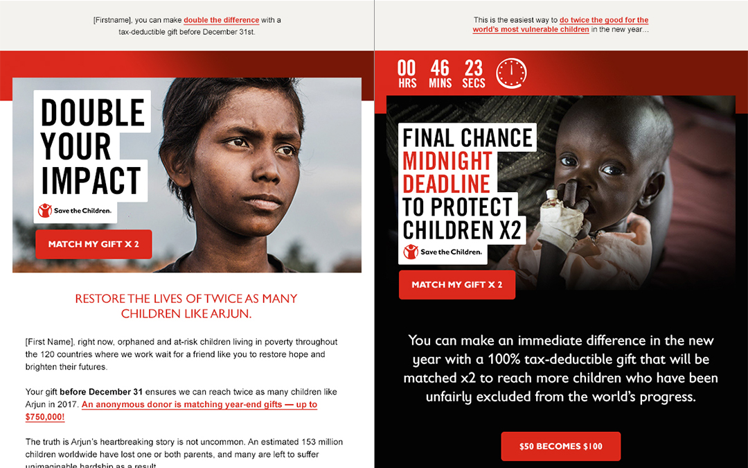
The example below shows how our team worked with Save the Children to employ this strategy successfully over their 2016 end of year email fundraising campaign.

You can see that all of these emails use basically the same stationery, and that they adhere to the same standards for color, fonts, and graphics. They even follow the same structure for fundraising emails:
• Preview text that includes a text link version of the main call to action
• Photographic call to action: featured child with heading text and button
• The content
• The call to action again
• Sign-off and footer
But it’s clear that with just a few simple color tweaks the final email breaks dramatically from the established visual aesthetic. It’s still “on brand,” but it’s darker, bolder, and shorter. And it worked exactly how we hoped it would: the “different” email proved to be one of the top generators of revenue (when we tried this tactic for the first time during Save the Children’s 2015 end of year campaign, the “different” email was actually the second highest performing email of the series).
Consider your own approach to email design and where your organization might be able to experiment with breaking its typical patterns. Be careful not to go crazy though. You have to establish a strong pattern before you can break it.