
There’s an ongoing philosophical debate about whether the 20th century design principle – form follows function – should influence contemporary web design. Some argue it’s the best way to ensure intuitive user experience, while others see it as a kind of totalitarian assumption that has homogenized creative industries.
I won’t take a side here except to say that if your site has a specific performance goal like generating online donations (or petition signatures, event registrations, etc.), then at the very least, your forms should be designed in a way that maximizes their ability to perform intended functions. Make them unambiguous, intuitive, and brief.
As a quick reference for general best practices, I’ve pirated lots of smart advice from around the web and elaborated upon it here. Let these guidelines be your map to unlocking the hidden treasure of better UX on forms.
Multi Column vs. Single Column Layout
Research generally confirms a single column layout for form fields is better for usability than a multi column layout. The fundamental reason is arranging fields in a single column reduces the amount of eye movement required for a user to get from field to field. Basically, it makes reading easier.
A disadvantage of this approach, however, is that strictly confining all fields to one column can elongate the form considerably, requiring users to scroll more than they would if fields were arranged more efficiently on the page. We know at this point most users are used to scrolling and not deterred by it, so it may not be a critical issue. Still, why not explore more efficient ways to make use of the space on your page?

A good compromise is to appose directly related fields, such as “first name” and “last name” or “city, state, zip.” One study showing the superiority of single column layouts notes the exception for fields collecting directly related information. The following example takes such an approach:
Audiences that are accustomed to reading left to right, top to bottom, should find this layout intuitive. In fact, NNG’s “F Pattern” for how users move visually through content may provide further support for this method.
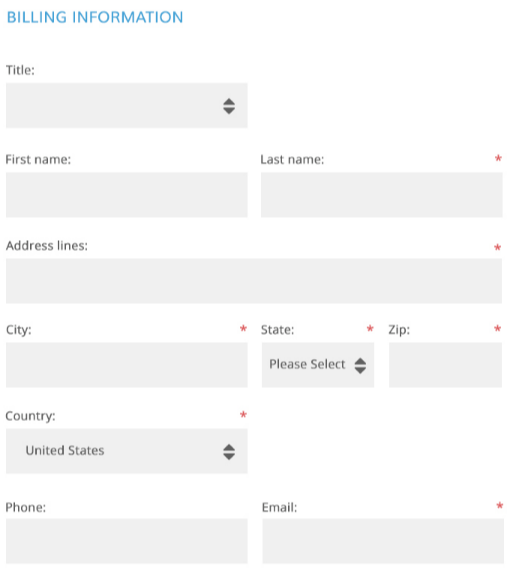
If you have numerous input fields, it can also be helpful to group them into logical sections. This breaks the form into manageable chunks.
Labeling & Validating Fields
Group labels and fields so it’s clear which applies to which, and be careful how your labels are aligned.
Top aligned labels are easier to scan quickly and identify with a corresponding field. They also create less width in the form, so are easier to plan for in a responsive design. However, they do add length, meaning a longer form and potentially more scrolling for your user.
Horizontally aligned labels don’t create excess length, but they can be harder to associate with a field depending on whether they are justified right or left. Luke Wroblewski offered a detailed analysis of all these pros and cons some time ago.
Also, avoid using all uppercase letters in field labels. All caps make words blockier and harder to distinguish from each other, which negatively impacts users’ ability to quickly scan through a form for what information is required.
Likewise, avoid using placeholder text within inputs as labels for those fields. There are myriad reasons why this causes issues, many of which can be read here. In short:
- It can cause users to forget what information they are inputting
- It requires users to delete their input and click out of the field to refer back to the label
- Users with javascript disabled might never see the label
- It can make validation more difficult
- It makes fields less noticeable and likelier to be overlooked
Finally, where possible, use inline validation as a communication tool to assist your users, heighten convenience, and confirm successful inputs. More and more, smart designers are utilizing inline validation conversationally to forge great relationships with users. Check out some great examples and analysis courtesy of DesignModo.
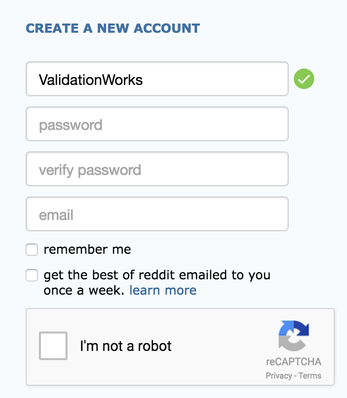
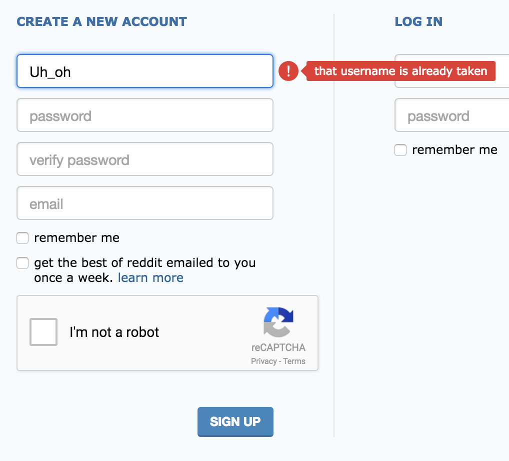
Reddit uses simple inline validation to display whether a selected username is available.
Required vs. Optional Fields
Keep your fields to a minimum by not asking for information that isn’t absolutely necessary. If you do ask for supplemental info, consider making those fields optional, and label them as such.
Required fields have conventionally been marked with an asterisk ( * ). However, more and more designers are now marking only the optional fields. One reason is because the word “optional” is more immediately understood than the lone red asterisk. Similarly, it tends to reduce visual distractions on your form, since you’ll generally have fewer optional fields on your form than required ones. If you do have a majority of optional fields on your form, then you are likely overburdening your users and asking for a lot of information you don’t truly need.

Buttons
Radio buttons are still widely used for option selectors on forms – the most common instance likely being donation amounts.
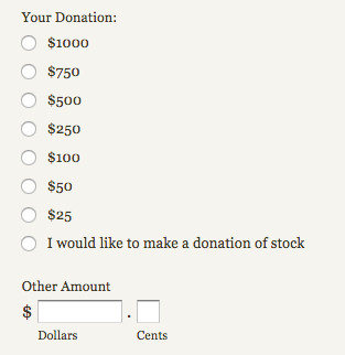
It’s good to replace these with something larger and bolder, not just because they’re underwhelming, but also because trying to select a radio button on a mobile device is a little like swatting at a mosquito with a baseball bat. Large, “finger friendly” buttons on the other hand provide a smooth selection experience regardless of the user’s device.
Furthermore, it’s smart to suggest a donation amount by default. Determine your average online gift, then suggest something slightly upwards of that.
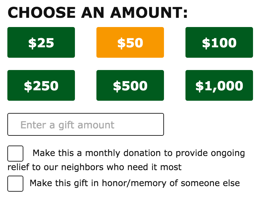
When labeling your buttons, be succinct but also descriptive. Especially for donate buttons. For example, the phrase “Complete My Donation” or “Register Me!” is much clearer and more compelling than simply “Submit.”
Another nice detail to enhance UX is to reference the selected donation amount within the donate button label itself. For example, “Donate $250.”

Stay Focused on the Goal
Style your form to integrate smoothly with the rest of your site, but also remove elements distracting users from completing the desired action. This means nixing unnecessary content, this includes the main site navigation and other components in your page wrapper that link away from the form itself. The donation form we recently created for Muscular Dystrophy Association is a prime example of a simple yet elegant form without any clutter.
If there are links you feel must remain accessible from your form, a waiver or privacy policy for example, set them to open in a new tab or window.
Additional Sources: